Design Guide
How this site was made
Designing slow light.
Casa Lumen sells one thing: the feeling of an afternoon with nowhere to be. Every decision on this site — color, type, motion — was made to slow the visitor down. This page documents those decisions.
01 · Palette
Stone, sea, and the hour before dinner.
The palette is lifted from the island itself: limestone walls bleached by sun, terracotta pots on the terrace, the sea past the pines, olive trees on the terraces. No pure white, no pure black — nothing on Mallorca is either.
Sun-bleached Sand
#FAF6EF
Terracotta Stone
#C4704B
Sea
#4A7A8C
Olive
#6B6B47
Warm Charcoal
#33302B
02 · Typography
A voice that never raises itself.
Cormorant Garamond carries the headlines — a light, high-contrast serif whose italics do the emotional work. It reads like the label on a very good bottle of olive oil: elegant without trying.
Jost handles everything else at a light weight, with small-caps labels tracked out to 0.32em. The pairing is travel-magazine, not tech-startup: the serif dreams, the sans keeps the reservations.
Display — Cormorant Garamond
The light stays longer here.
Body — Jost Light
There is no lobby. There is a courtyard, and someone in it who knows your name.
Labels — Jost small caps
Casa Lumen · Serra de Tramuntana · Mallorca
03 · The Living Photograph
Stills that breathe.
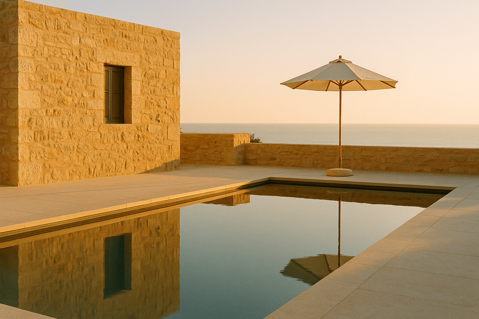
The signature technique is the cinemagraph treatment: every image on the site is alive, but barely. Three layers work together, and all of it runs in CSS — no video files, nothing to buffer.
Watch closely — the frame is drifting
Ken Burns drift
Each image pans and zooms over 16–20 seconds on a GPU-composited transform, alternating direction so adjacent frames never move in sync. Slow enough that you feel it before you see it.
Film grain
An animated SVG fractal-noise overlay, stepped at five frames like real film stock, blended in overlay mode. It keeps the AI-generated photography honest — texture where digital images are too clean.
Light leaks
Radial amber gradients drift across each frame in soft-light blend mode on a 14–17 second cycle, like sun moving through shutters. Two variants alternate so no two frames glow alike.
Everything honors prefers-reduced-motion — visitors who ask for stillness get true stills. And the whole system degrades to plain photography on any browser that objects.
04 · Why it works
The design argument.
Slowness as positioning
Most hotel sites shout amenities. Casa Lumen's competitors are louder, so this site wins by being quieter: long fades, drifting frames, copy that reads at walking pace. The pacing is the promise.
Specificity as trust
Marga argues with the fishermen. Toni stops at the good bakery. Ninety-one steps to the cove. Invented details, but concrete ones — specificity is what makes a fictional brand feel inhabited, and what makes a real one feel honest.
Restraint as craft
One serif, one sans, five colors, three motion patterns. Every section reuses the same small vocabulary, so the whole site feels like one continuous afternoon rather than a template with sections.